Fruitables 예제 제목과 버튼 양쪽 정렬/카드배열/html 정리
https://themewagon.github.io/fruitables/
문제는 제목과 버튼의 배치가 나란히 정렬되지 않고 몰리거나 한줄 아래로 내려가는 현상이었다. 겨우 고쳤다.
고친 화면

<div class="middle-t-wrap-menu">
  <h2>Our Organic Products</h2>
  <ul class="middle-t-wrap-menu-list">
    <li><button>All</button></li>
    <li><button>Vegetables</button></li>
    <li><button>Fruits</button></li>
    <li><button>Bread</button></li>
    <li><button>Meat</button></li>
  </ul>
</div>
.middle-t-wrap-menu {
display: flex;
justify-content: space-between;
align-items: center;
/* ✅ 핵심1: h2와 버튼 리스트(ul)를 좌우로 배치하게 만듦 */
/* 둘이 같은 부모 아래에 있고 flex라서 옆으로 정렬 가능해짐 */
}
.middle-t-wrap-menu-list {
display: flex;
gap: 10px;
/* ✅ 핵심2: 버튼 리스트 안 버튼들을 가로로 배치 */
/* ul 자체는 오른쪽에 붙고, 내부 버튼들은 간격 유지함 */
}
.middle-t-wrap-menu-list li {
list-style: none;
/* ✅ 핵심3: 버튼 앞에 점 없애기 (ul 기본 스타일 제거) */
}💡 핵심 원리 정리해서 주석으로 남긴다
.middle-t-wrap-menu {
  display: flex;               /* 자식 요소들을 가로로 배치 */
  justify-content: space-between; /* 왼쪽과 오른쪽 요소를 양끝에 정렬 */
  align-items: center;         /* 세로 가운데 정렬 */
  /* 여기서 중요한 건: h2와 ul이 형제 요소여야 함! */
}

.middle-t-wrap-menu-list {
  display: flex;               /* 버튼들을 가로로 배치 */
  gap: 10px;                   /* 버튼 사이 간격 만들기 */
  /* 이걸 안 하면 버튼들이 붙어서 보기 안 좋아짐 */
}

.middle-t-wrap-menu-list li {
  list-style: none;            /* ul 기본 점 제거 */
  /* 이걸 안 하면 버튼 앞에 뻔뻔하게 점 붙음 */
}
🚨 확인:
- h2랑 버튼이 같은 부모 안에 형제로 있어야 flex가 좌우 정렬됨
- 부모에 display: flex, justify-content: space-between 필수
- ul 안의 버튼 줄에도
display: flex안 넣으면 버튼 줄 안 예쁘게 나옴 - 안 되면
margin-left: auto같은 CSS로 적용
📦 카드 배열 방식
/* 카드들을 감싸는 부모 */
.card-container {
  display: flex;
  flex-wrap: wrap;
  gap: 20px;
  justify-content: space-between;
}

/* 하나의 카드 */
.card {
  width: 23%; /* 4개씩 배열을 위한 비율 */
  height: auto;
  background: white;
  border-radius: 12px;
  border: 2px solid #81C408;
  box-sizing: border-box;
  display: flex;
  flex-direction: column;
  justify-content: space-between;
  padding: 20px;
}

/* 카드 안의 이미지 */
.card-img img {
  width: 100%;
  height: 180px;
  object-fit: cover;
  border-top-left-radius: 12px;
  border-top-right-radius: 12px;
}
💡 정리 주석
/* .card-container: 카드 정렬의 중심. flex + wrap으로 한 줄에 4개 정렬 */
/* .card: 카드 하나의 스타일. width % 계산 필수! padding 줄 땐 box-sizing 중요 */
/* .card-img img: 이미지가 넘치지 않도록 제한, object-fit으로 깔끔하게 자르기 */
___
우선 박스 두 개를 삭제하고 대신 container 박스를 활용했다.
주석은 선생님이 수정하신 영역을 중심으로 덧붙임
기존 구조에서 변경된 핵심은 아래와 같음
[1] 배너 레이아웃 배치 구조 변경
변경 전: 배너 이미지 따로 감싸고, .main-banner-bg 안에 이미지 넣음
변경 후: 이미지 태그를 section.main 안에 바로 배치함
이유: 굳이 감쌀 필요 없이 background처럼 취급 가능 / position 기준 단순화
.section.main {
  position: relative;      /* 안쪽 요소(컨텐츠 박스)에 position: absolute 줄 거라 기준 잡음 */
  height: 400px;           /* 배너 높이 고정 */
  overflow: hidden;        /* 안 넘치게 */
}

.main img {
  width: 100%;             /* 전체 폭 채우기 */
}
[2] 텍스트, 슬라이드 위치 배치 방식
container 위치를 image 위에 얹기 위해 absolute 처리
그리고 left: 15%를 주어서 배너 텍스트가 너무 붙지 않게 했음
.main .container {
  display: flex;               /* 텍스트 / 슬라이드 좌우 나열 */
  justify-content: space-between;
  align-items: center;

  position: absolute;
  top: 50%;
  left: 15%;
  transform: translateY(-50%); /* 수직 가운데 정렬 */
}

.main .container .slide-left {
  width: 50%;
}

.main .container .slide-right {
  width: 50%;
  position: relative;  /* 화살표 버튼 absolute 기준 위해 필요 */
}
[3] 슬라이드 슬라이딩 구조
.slide-box는 overflow: hidden으로 슬라이드 넘침 방지
.slides는 실제로 움직이는 요소. width는 슬라이드 개수에 따라 조정
.slide는 개별 슬라이드, 부모(.slides)의 절반 크기
.slide-box {
  width: 100%;
  border: 2px solid blue; /* 디버깅용 보더 (제거 가능) */
  overflow: hidden;
}

.slides {
  display: flex;
  width: 200%;
  transition: transform 0.5s ease-in-out;
}

.slide {
  width: 100%; /* 부모 slides가 200%니까, 각 슬라이드는 100%씩 */
}
[4] 슬라이드 화살표 버튼
.slide-right > button {
  width: 20px;
  height: 20px;
  position: absolute;
  top: 50%;
  transform: translateY(-50%);
}

.slide-right > button.leftbtn {
  left: 10px;
}

.slide-right > button.rightbtn {
  right: 10px;
}

/* 버튼 안에 있는 이미지도 같이 사이즈 맞춤 */
.slide-right > button img {
  width: 100%;
  height: 100%;
}
선생님이 해주신 주요 핵심은:
- 이미지 background처럼 직접 넣고 position absolute로 덮기
- container를 absolute + flex 처리해서 슬라이드/텍스트 나열
- 화살표는 relative 기준 안에서 absolute 정렬
- 불필요한 감싸기 줄이고 구조 최소화로 배치 간결화
결과적으로 구조를 크게 바꾸지 않되,
position 중심으로 재정렬해서 배치가 안정되게 만드신 거임.
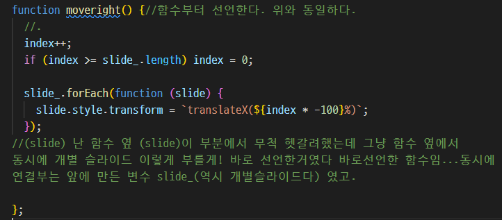
🔗 function 내가 헷갈려해서 정리함.
| 상황 | 비유 |
|---|---|
| function greet() {} | 📁 “greet라는 함수 파일 만들어서 나중에 호출함” |
| function() {} | 📦 “여기서 바로 써먹는 일회용 함수, 이름 없음” |
| addEventListener('click', greet); | 🔗 “아까 만든 greet라는 함수를 클릭에 연결” |
| 상황코드 | 예시 | 쓰는 의도 |
|---|---|---|
| 함수 만들어서 나중에 쓸 거야 | function moveleft() {} | 이름 붙여서 나중에 호출하려고 |
| 그걸 이벤트에 연결할 거야 | leftbtn.addEventListener('click', moveleft); | 만들어둔 함수 불러다 연결 |
| 이름 필요 없고 지금 넣을래(익명함수) | leftbtn.addEventListener('click', function() {}); | 즉석 함수 전달 |
그리고 중간에 CSS를 다시 손댔는데 그 이유는 슬라이드 박스(보여지는 부분) 크기를 줄이고 버튼 두 개가 나란히 배치되게 하고 싶은데 바꾼 뒤 어떻게 했는지 기억이 안 나서 넣은 거
* {
  margin: 0;
  padding: 0;
  box-sizing: border-box;
  list-style: none;
  text-decoration: none;
  color: inherit;
}

/* #ffc107 노랑
#81C408 초록
#fd7e14 주황
#F4F6F8 연그레이
#45595B 다크그레이
#6c757d 그레이 */

.container {
  width: 70%;
  margin: 0 auto;
}

.header-top {
  background: #81C408;
  color: #eee;
  font-size: 12px;
  display: flex;
  justify-content: space-between;
  padding: 10px;
}


.header-bottom {
  display: flex;
  justify-content: space-between;
  align-items: center;
  padding: 20px 0;
}

.menu-list {
  display: flex;
  gap: 30px;
  justify-content: center;
}

.menu-list li a {
  font-weight: bold;
  color: #333;
}
/* 드롭다운용 */


.dropdown {
  position: relative;
}


.dropdown-list {
  display: none;
  position: absolute;
  z-index: 11;
  /* 슬라이드에 메뉴가 가려지길래 더 많이 줬다 */
}


.dropdown-list.open {
  display: block;
}
/* 배너 */


.main {
  position: relative;
  height: 400px;
  overflow: hidden;
}

.main img{
  width: 100%;
}

.main .container {
  display: flex;
  justify-content: space-between;
  align-items: center;

  position: absolute;
  top: 50%;
  left: 15%;
  transform: translateY(-50%);
}

.main .container .slide-left {
  width: 50%;
}

.main .container .slide-right {
  width: 50%;
  position: relative;
}


/* 슬라이드 */
.slide-box {
  width: 100%;
  overflow: hidden;
  border-radius: 10px;
}
.slides {
  display: flex;
  width: 200%; /* 2개 슬라이드니까 100% * 2 */

}

.slide {
  position: relative; /* 이 기준은 슬라이드 이미지 중앙 버튼을 위한 것 */
  width: 100%; /* 각 슬라이드는 부모 너비의 절반 */
  transition: transform 0.5s ease-in-out; /* 슬라이드 이동. 내가 개별 슬라이드를 미니까 여기에 이동 애니메이션을 주는 것이 맞다. */
}

.slide img{
  width: 100%;
}


.slide-right {
  width: 70%; /* 슬라이드랑 똑같이 맞춰야 버튼이 같이 이동함 */
  position: relative;
}
.slide-right > button {
  width: 30px;
  height: 30px;
  z-index: 10;
  position: absolute;
  top: 50%;
  transform: translateY(-50%);
}

.slide-right > button.leftbtn {
  left: 10px;
}

.slide-right > button.rightbtn{
  right: 10px;
}

.slide-right > button img {
  width: 100%;
  height: 100%;
}

.slide .slide-btn {
  position : absolute;
  color: #eee;
  background-color : #ffc107;
  border: none;   /* 선 없애줘야 외곽선이 안 보임 */
  font-size: 20px;
  padding: 5px 10px;
  border-radius: 10px;
  z-index: 10;
  top: 50%;
  left: 50%;
  transform: translate(-50%, -50%);

}

/* 중간 카드 정렬 */

.middle-t-wrap {
  display: flex;
  justify-content: space-between;
  align-items: center;
  padding: 20px 0;
}

.middle-t-wrap-menu {
  display: flex;
  justify-content: space-between;
  align-items: center;
  width: 100%;
}

.middle-t-wrap-menu h2 {
  margin: 0;
}

/* 오른쪽에 몰리고 싶게 하고 싶으니 flex-end */
.middle-t-wrap-menu-list {
  display: flex;
  gap: 10px;
  flex: 1;
  justify-content: flex-end;
}

.middle-all-wrap {
  display: block;
  align-items: center;
}

.middle-b-wrap {
  display: flex;
  justify-content: flex-start;
  flex-wrap: wrap;
  gap: 10px;
  /* 카드 사이 간격 */

}

.card {
  width: 23%;
  /* height: 90%; */
  background: white;
  border: 1px solid #ffc107;
  border-radius: 12px;
  box-sizing: border-box;
  overflow: hidden;
  display: flex;
  flex-direction: column;
  justify-content: space-between;
}


.card-img {
  position: relative;
  height: 200px;
  overflow: hidden;
}

.card-img img {
  width: 100%;
  /* 부모(card)의 너비에 맞추기 */
  height: 200px;
  /* 세로 제한 줘서 튀어나오지 않게 */
  object-fit: cover;
  /* 비율 유지 + 넘치는 부분은 잘라서 꽉 차게 */
}


.card-title-text {
  padding: 20px;
  gap: 10px;
  text-align: center;
}

/* 상단 과일 스티커 */
.card-t-text {
  position: absolute;
  top: 10px;
  left: 10px;
  background: #81C408;
  color: white;
  font-size: 12px;
  padding: 5px 10px;
  border-radius: 20px;
  z-index: 10;
}

.card-price {
  display: flex;
  justify-content: space-between;
  align-items: center;
  margin-top: 10px;
}

.card-btn {
  cursor: pointer;
}
이제 탭 기능을 자바 스크립트로 구현하기
// ✅ 탭 기능용 JS (시험 대비용으로 단순하게 작성)

const tabButtons = document.querySelectorAll('.tab-btn'); // 메뉴 버튼들
const cards = document.querySelectorAll('.card'); // 모든 카드들

// 탭 버튼 클릭 이벤트 연결

for (let i = 0; i < tabButtons.length; i++) {
  tabButtons[i].addEventListener('click', function () {
    const category = tabButtons[i].textContent.toLowerCase(); // 버튼 텍스트로 구분 (all, vegetables 등)

    for (let j = 0; j < cards.length; j++) {
      const card = cards[j];

      // "all" 선택 시 모든 카드 보이기
      if (category === 'all') {
        card.style.display = 'block';
      } else {
        // 해당 카테고리 포함되면 보이고, 아니면 숨김
        if (card.classList.contains(category)) {
          card.style.display = 'block';
        } else {
          card.style.display = 'none';
        }
      }
    }
  });
}